
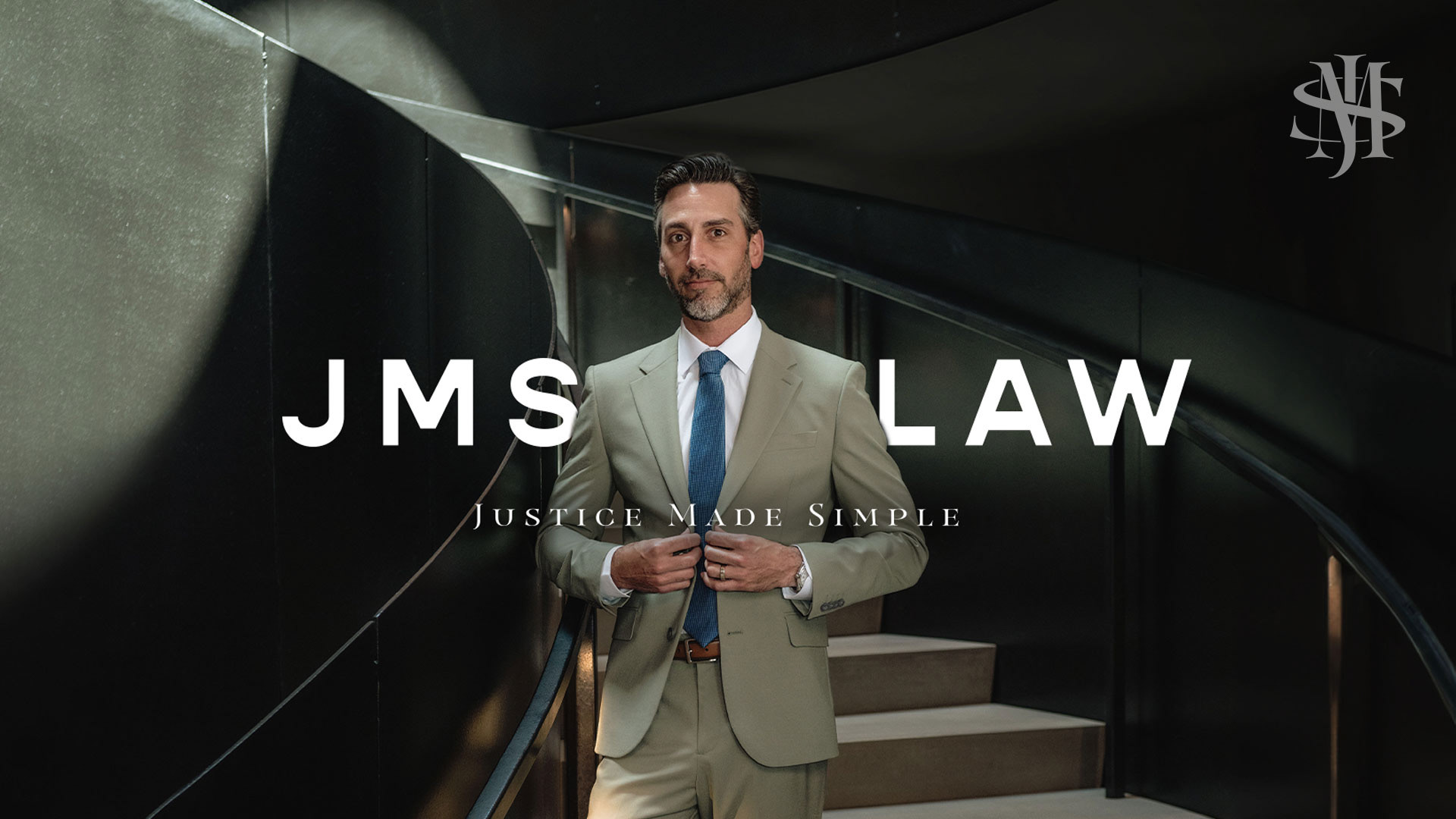
GRZYB Media partnered with JMS Law, a boutique legal practice serving clients across Central Florida, to redefine their brand identity, collateral system, and web presence with a level of sophistication and clarity that reflects the firm’s expertise, personality, and client-forward approach. At the heart of the project was a need for a visual language that stood apart from typical legal branding — one that felt calm, confident, refined, and subtly elevated.

The JMS team came with a clear set of values, but the visual expression of the brand needed to match that presence: smart without being stiff, distinguished without being cold, and unmistakably professional with a personal edge. GRZYB built a system that balanced these forces through deliberate design and creative direction.
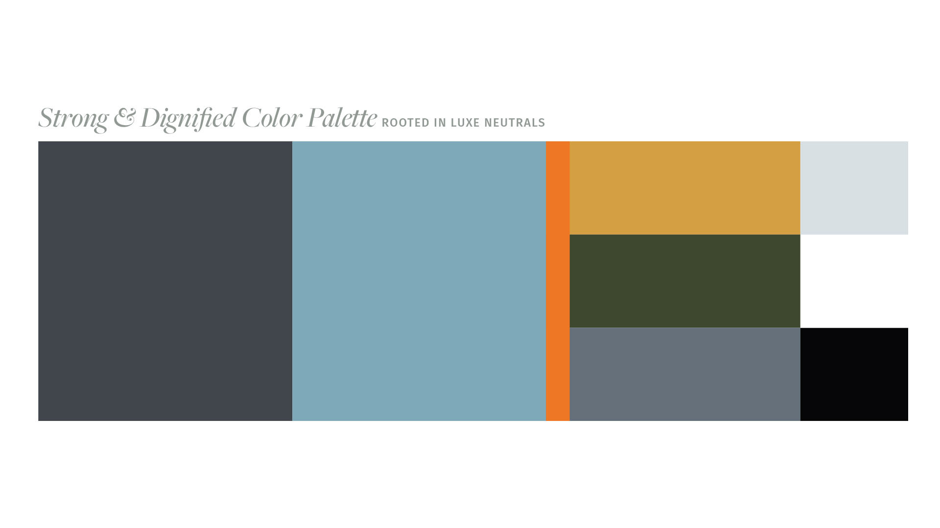

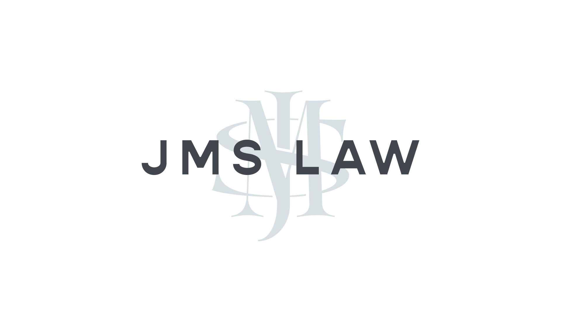
The brand identity centers on a refined visual palette and typographic hierarchy that favor restraint over noise. A mix of deep neutrals and thoughtful accent tones creates a base that feels sophisticated and grounded, while carefully selected typefaces give the brand a modern rhythmic clarity — trusted and authoritative without being heavy.

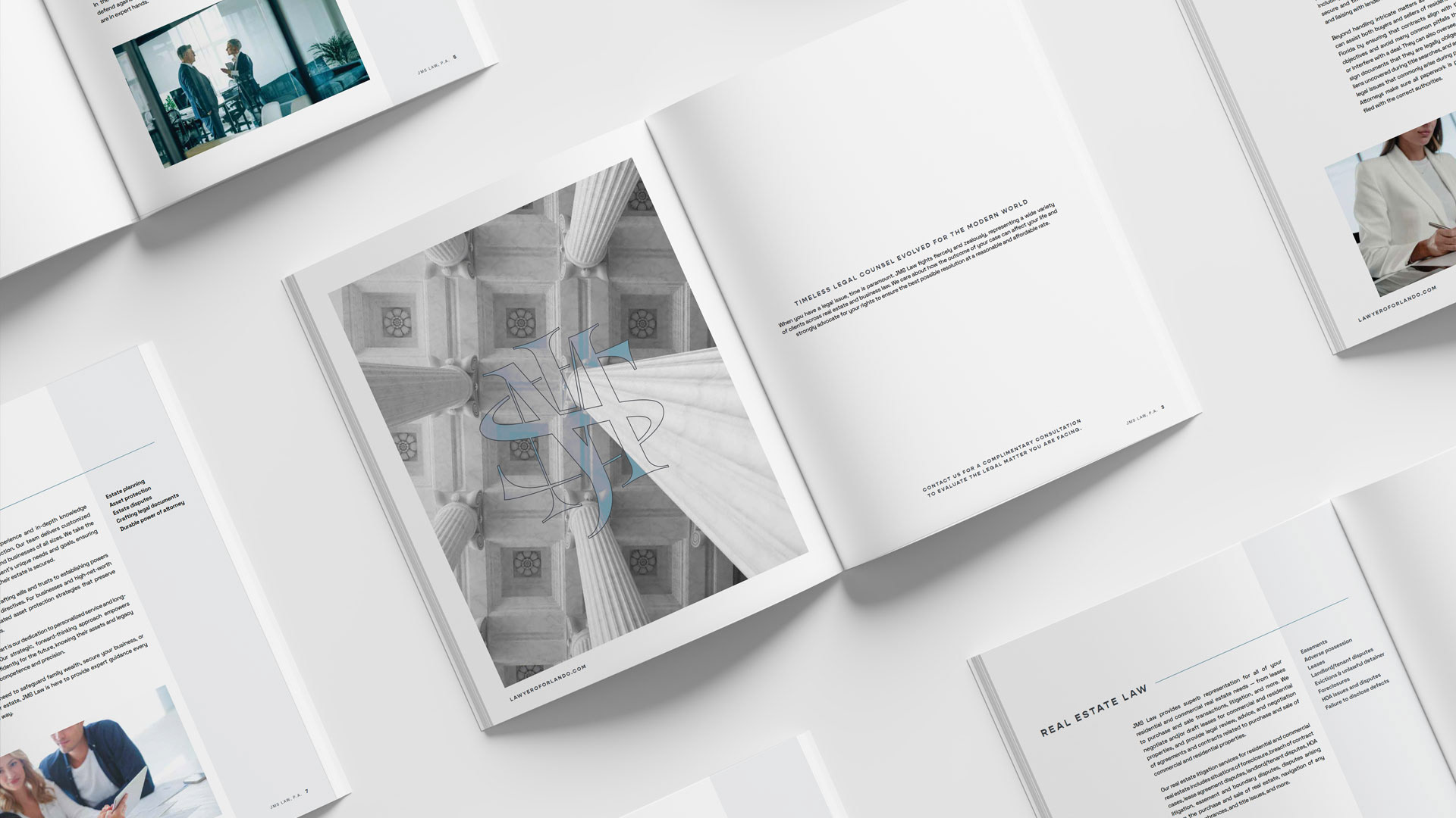
While JMS Law had a strong foundation and clear point of view, the brand needed a visual system that felt more aligned with how the firm operates in practice: measured, strategic, and client-focused. GRZYB led a full rebrand, including brand identity, web design, & creative oversight of key visual assets, ensuring cohesion across touchpoints.
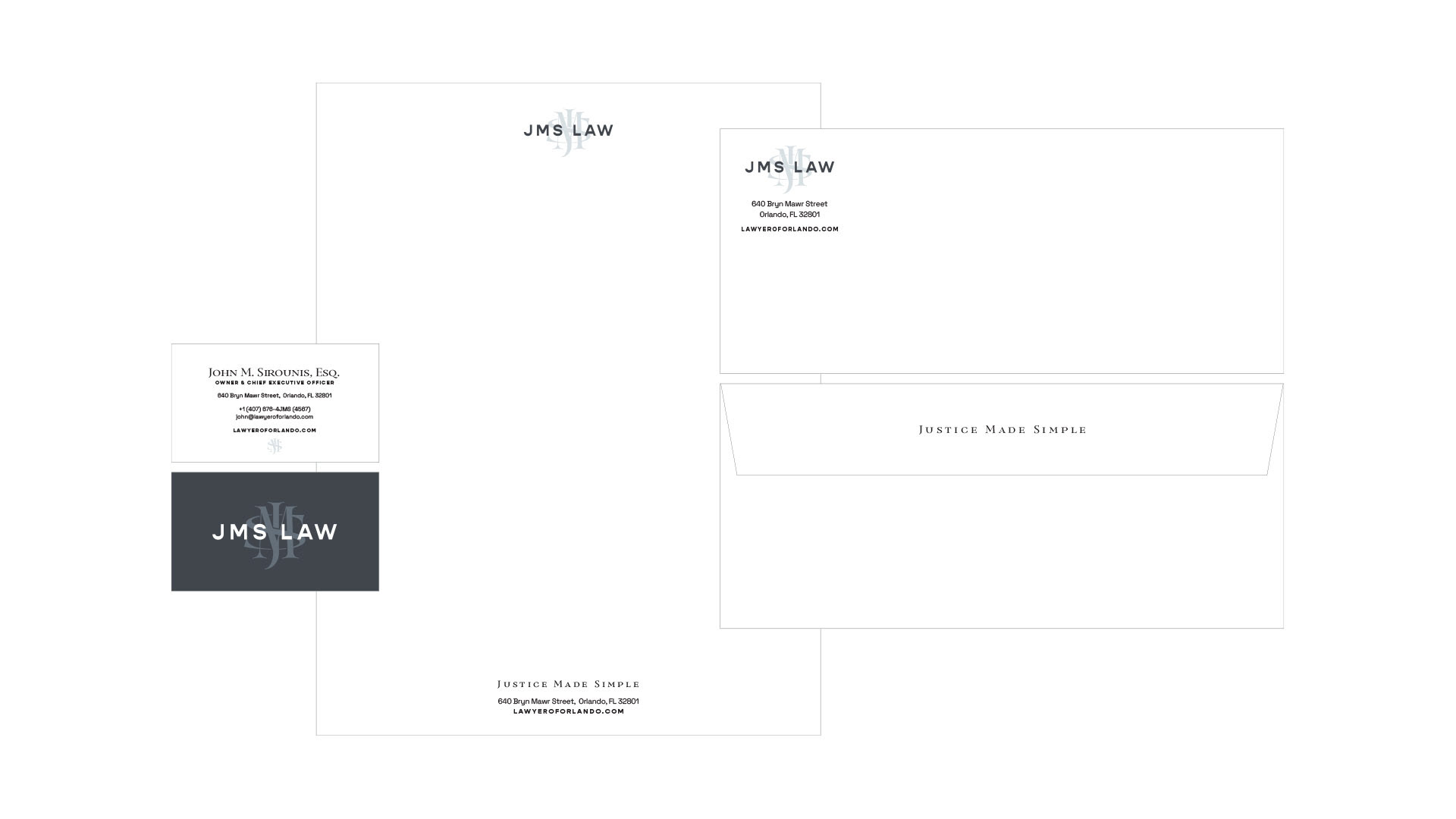
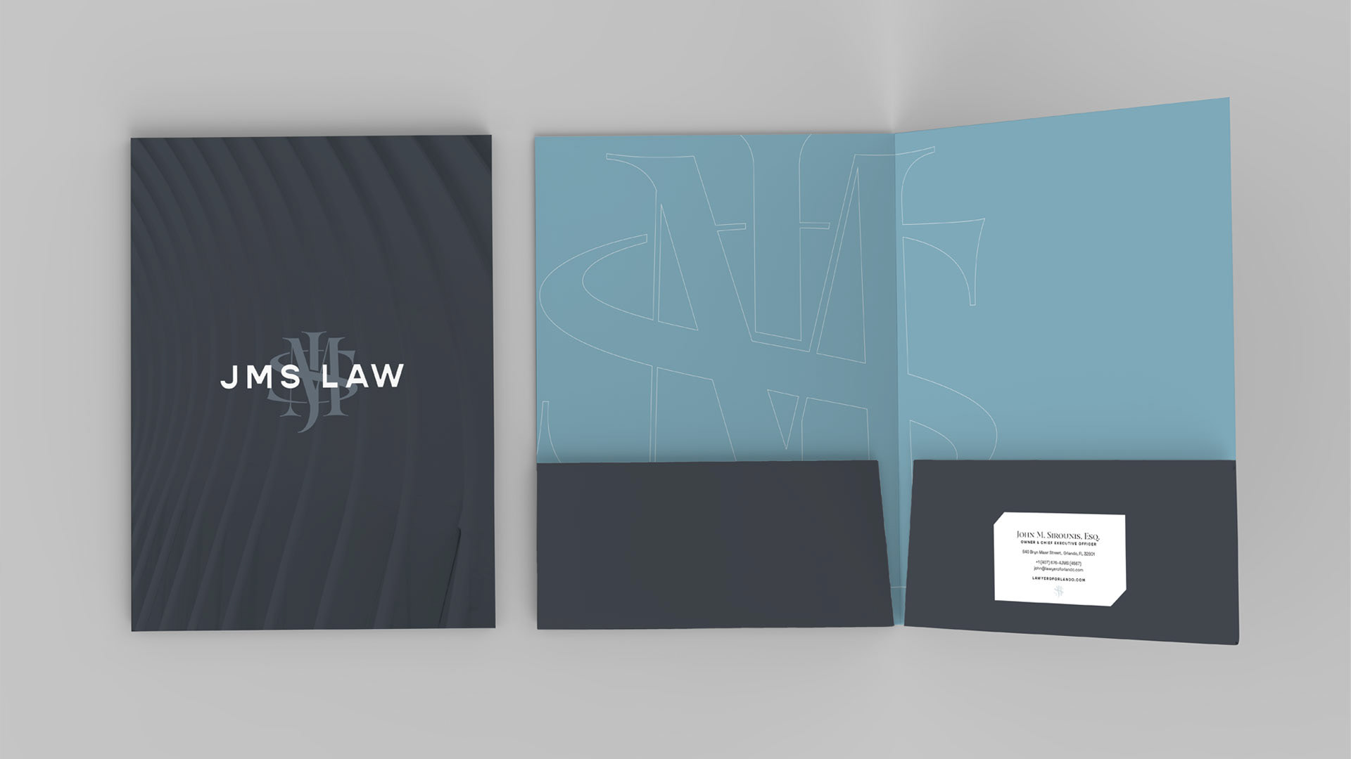
The resulting identity favors restraint and clarity, using a controlled palette, refined typography, and clean layouts to communicate credibility and calm. Rather than relying on familiar legal clichés, the brand was designed to feel modern and composed — confident without being imposing, elevated without feeling inaccessible.
The outcome is a brand that feels distinctly sophisticated while remaining grounded in personality, giving JMS Law a visual presence that matches the way the firm shows up for its clients: steady, considered, and assured.